
collaborating
This comment from Diane got me to thinking that I could add a bit more background on my recent collaboration adventure, "Gilder's paste, who knew? looks great! How did
you like the collaboration? Did you find yourself making pieces you might not
have conjured without prompting as you melded your style with their requests,
and did it blow open some creative doors that might take you down new roads?"
I'd been seeing gilders paste around ... it's amazing on potter's clay - check out Grey Bird Studio on Etsy - and I had seen that it could be used on metal clay on the Cool Tools and Rio Grande sites. So it was definitely on my radar. It turned out to be just the ticket for my faux silver jewels. Like I was saying, there's definitely a learning curve, but I did buy a few different colors from this Etsy seller and I'm hoping I'll have a chance to play with it some more.
The Cool Tools video how-to suggested using blue under silver for a patinated look, so that's where I started. Unfortunately, it was not the look I was hoping for. So I took a closer look at my own pieces, hoping to see the layers of color more clearly. What I ended up using was plain old black under the silver and I'm happy with the look. If I do this again, I want to try more layering of color, maybe with the Damson and the Iris Blue under the Silver. BTW, I used Vintaj Glaze to seal the finished pieces.
As for the actual collaboration ... it was about as perfect as I could hope for. To start with Fabio and Rebecca are incredibly nice and very accessible. Next, I love their aesthetic and day to day out of the box thinking. Seems to me if you're going to collaborate with another artist, the process should uplift everyone involved and the finished work should be greater than the sum of the collaborators ... does that make sense? The finished work should meld everyone's aesthetic to create something new and unique.
Working with them challenged me both technically and creatively. I rarely make work that is referential, not that I haven't, but I just don't go there very often. So looking for a way to reference a specific object from a particular period and have it still look like my work took some time. I've gotta say, I do love how the keys turned out! They are very definitely KVK pieces, but the silhouette is still very Gothic.
This one's my fave ...
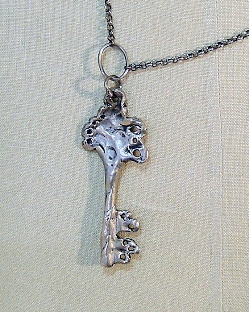
But looking back, I think the biggest challenge was taking the two elements and combining them in a way that immediately said, "lock & key," but looked a bit more interesting then just a plain old lock and key. There's a ton of steampunk jewelry out there using keys and keyholes, mostly in classic Victorian silhouettes. The final configurations came to me the morning before one of our Skype calls and I'm still quite pleased with the finished look ... especially that they hang kind of wonky and are far from perfect.
I've no idea if we'll work together again and I'm not sure if or how this experience will affect my own future work or if anything else will come of the pieces that were created. Will I be compelled to make more keys ... maybe. Will I refer to ages past for future inspiration ... pretty much a given. Will I be open to future collaborations ... absolutely.
Whatever follows, all I know is this particular project was near perfect and will be hard to top.
onward .........
l i g a - kvk
I'd been seeing gilders paste around ... it's amazing on potter's clay - check out Grey Bird Studio on Etsy - and I had seen that it could be used on metal clay on the Cool Tools and Rio Grande sites. So it was definitely on my radar. It turned out to be just the ticket for my faux silver jewels. Like I was saying, there's definitely a learning curve, but I did buy a few different colors from this Etsy seller and I'm hoping I'll have a chance to play with it some more.
The Cool Tools video how-to suggested using blue under silver for a patinated look, so that's where I started. Unfortunately, it was not the look I was hoping for. So I took a closer look at my own pieces, hoping to see the layers of color more clearly. What I ended up using was plain old black under the silver and I'm happy with the look. If I do this again, I want to try more layering of color, maybe with the Damson and the Iris Blue under the Silver. BTW, I used Vintaj Glaze to seal the finished pieces.
As for the actual collaboration ... it was about as perfect as I could hope for. To start with Fabio and Rebecca are incredibly nice and very accessible. Next, I love their aesthetic and day to day out of the box thinking. Seems to me if you're going to collaborate with another artist, the process should uplift everyone involved and the finished work should be greater than the sum of the collaborators ... does that make sense? The finished work should meld everyone's aesthetic to create something new and unique.
Working with them challenged me both technically and creatively. I rarely make work that is referential, not that I haven't, but I just don't go there very often. So looking for a way to reference a specific object from a particular period and have it still look like my work took some time. I've gotta say, I do love how the keys turned out! They are very definitely KVK pieces, but the silhouette is still very Gothic.
This one's my fave ...
But looking back, I think the biggest challenge was taking the two elements and combining them in a way that immediately said, "lock & key," but looked a bit more interesting then just a plain old lock and key. There's a ton of steampunk jewelry out there using keys and keyholes, mostly in classic Victorian silhouettes. The final configurations came to me the morning before one of our Skype calls and I'm still quite pleased with the finished look ... especially that they hang kind of wonky and are far from perfect.
I've no idea if we'll work together again and I'm not sure if or how this experience will affect my own future work or if anything else will come of the pieces that were created. Will I be compelled to make more keys ... maybe. Will I refer to ages past for future inspiration ... pretty much a given. Will I be open to future collaborations ... absolutely.
Whatever follows, all I know is this particular project was near perfect and will be hard to top.
onward .........
l i g a - kvk