
the evolution of a packaging design

the Piri Reis map
I'm on the verge of launching my new "Open" series of intuitive perfume blends and have been thoroughly engrossed in the packaging design and having a bang up good ol' time doing it! I must say, loving the graphic design part of the business really makes what I do so much easier. I am equally obsessed with making the work and packing it all up. It all boils down to one of my mantras ... how you do anything is how you do everything.
So I thought it would be fun to share the very long and winding road that led to my latest packaging designs ...
It all starts with finding an image of an ancient map, the Piri Reis map, in 2012. Some time later I began playing around with the image in Photoshop. After much cropping and shopping and lord knows what, I got to a version that I have been using off and on ever since. I've been using a faded version on my "thank you" cards for a while now.

shopped and faded map and border

super saturated shopped version
As I began working on the graphics for my perfume blends, I decided to really expand on this graphic element. In my huge image file of graphics, signs and symbols that I've collected for Talisman inspiration, I've got a very nice Zen circle (enso). A while back I had it made into a rubber stamp and it has since found its way into a variety of print and jewelry designs.

original enso
As to how all this graphics work gets done ... I'm something of a mid-range luddite with my graphic design skills, using Publisher for pretty much everything. It's what I've been using for almost 20 years and meets my needs and working methods and is the primary reason I keep using my PC instead of switching over to my fancy new IMac. One of the graphics things Publisher does is "set transparent color" on images. In the last few weeks I've been putting this little feature to seriously good use!
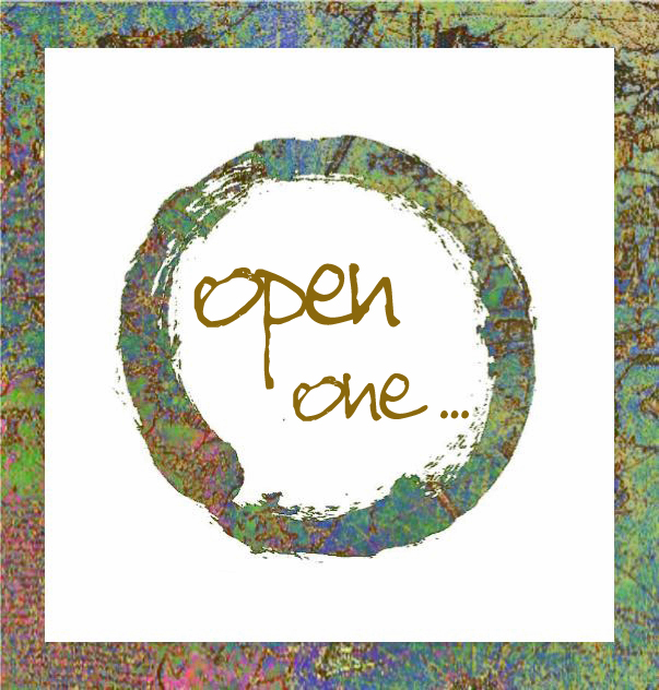
I took my original, super saturated map image and then popped the enso on top, made the black "transparent" and came up with this exceptionally lovely new version. And then inserted a white box inside the map image to create the border and then text on top. I've since changed the text to black ... shows up better on the bottles.


Today I was working on the perfume sample presentation and went a bit "set transparent color" crazy. It is SO much fun creating these kinds of graphic elements! I took some graphite line and dot drawings that I've been using for years (you may recognize the sepia version throughout this website) and did the same thing ... such great accents and borders! Here's what they look like before they got cropped and brightened up.

graphite line graphic elements before cropping and lightening the backgrounds
... and after
I did the same thing with these scans of beach pebbles. I can't wait to plug these into something ... they are so bloody cool!


Add a bunch of these assorted elements together and that's how I got to my finished perfume labels ...

"Open, one" 4ml perfume label

"Open" series perfume samples info card
I'm very close to launching! Next is figuring out how I want to package the actual bottles. I've got something pretty special that I'm getting ready to try, so stay tuned! It almost seems kind of crazy to go to so much effort for this exceptionally limited run of intuitive perfume, but it's just the way I am ... nothing half-way. Needless to say, I sincerely hope the perfume blends are well received ... I want to make lots more!
Like I was saying, it all comes back to "how you do anything is how you do everything" with a hefty dose of "god is in the details" and, boy howdy, do I love those details!
with deep gratitude - kvk